Watch How the World Became Obese
1 año
0 Visitas
Categoría:
Descripción:
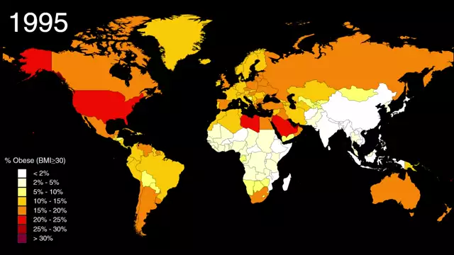
Between 1975 and 2014, the worldwide prevalence of adult obesity tripled. This map shows how it happened, country-by-country.
The color of each county represents its age-standardized obesity rate in the year shown. Hover over a country to see what its obesity rate was in 1975 and what it is today.
Read the full post: http://metrocosm.com/map-world-obesity/
The color of each county represents its age-standardized obesity rate in the year shown. Hover over a country to see what its obesity rate was in 1975 and what it is today.
Read the full post: http://metrocosm.com/map-world-obesity/


